Top 3 ugliest NHL helmet sponsorships.... so far.
A look at the best of the worst.
HockeyFeed
The National Hockey League has made the controversial decision of bringing in advertising on player helmets for the 2021 regular season and playoffs. Sponsorships on equipment or jerseys have long been a hotly debated topic in the sport of hockey, especially after the practice was adopted by other league's in North America like the National Basketball Association, and that debate continues to this day.
Personally I feel that, in light of the pandemic and in light of the huge financial losses the league has suffered as a result of it, the league chose the right time to make the move and it is for that reason that I believe the backlash from fans has been relatively mild. For some fans though it has been much easier to remain calm than for some others, because as we have learned during the unveiling of these new sponsorships on player helmets is that not all logos are created equal.
With that in mind, let's look at the 3 worst logos we've seen unveiled so far. At least in my opinion.
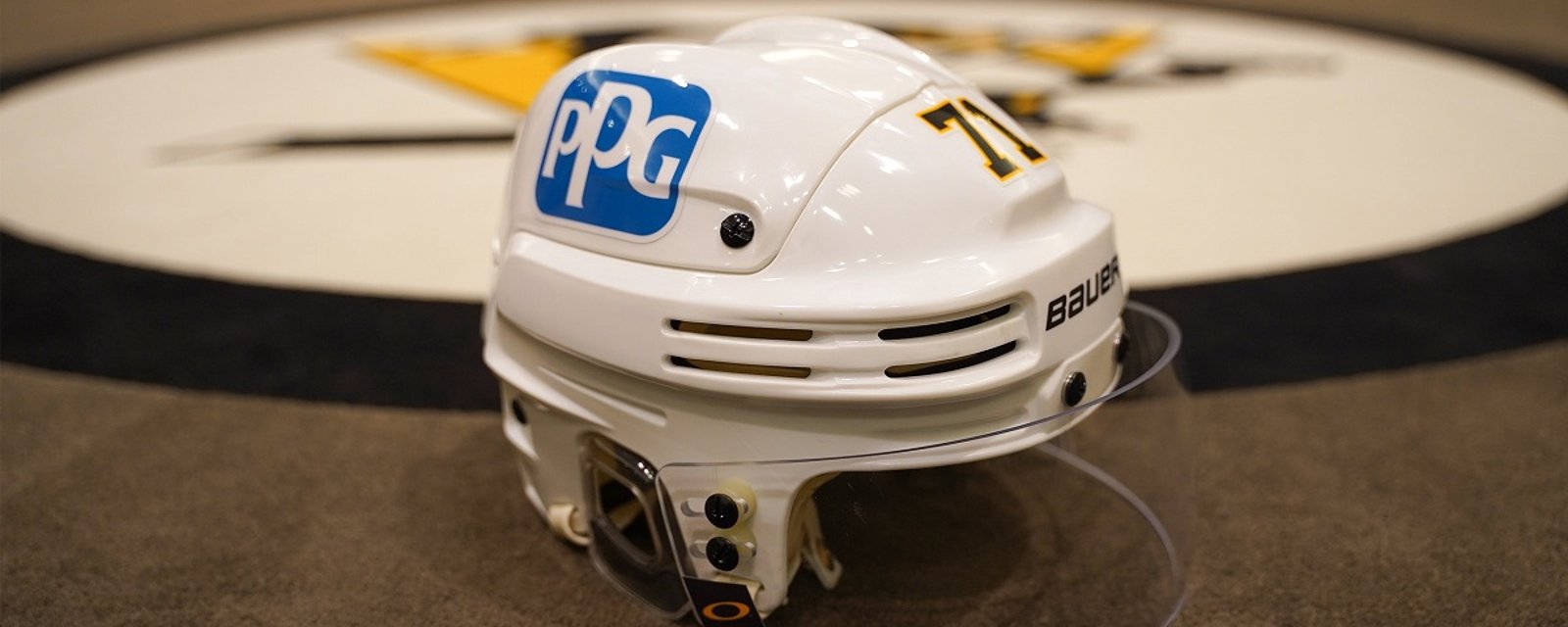
#1 The Pittsburgh Penguins.
I really don't think you can argue this one as the Penguins are the clear winners, or losers, in this top 3. The Penguins have chosen to go with their arena sponsor PPG Industries, and while I can certainly understand that decision the end result is nothing short of horrendous. The big blue square containing the 3 white letters "PPG" sticks out like a sore thumb on the Penguins white helmets.
There is one saving grace here for the Penguins, I do think the fact that they can nickname their helmets "paint buckets" is pretty catchy.
#2 The Nashville Predators.
I'm not sure if it's just the sharp contrast between the gold/yellow of the Nashville Predators helmets and the black, red and white, of the Bridgestone Corporation, or the fact that I simply hate the look of the Bridgestone logo to begin with, but this one is an eyesore for me. The image we have of the Penguins logo is a close up, so of course it's going to stand out a lot, but this one stands out even from a significant distance.
Like the Penguins, the Predators also went with the title sponsor of their arena so I can understand why they went in this direction. Still it looks awful.
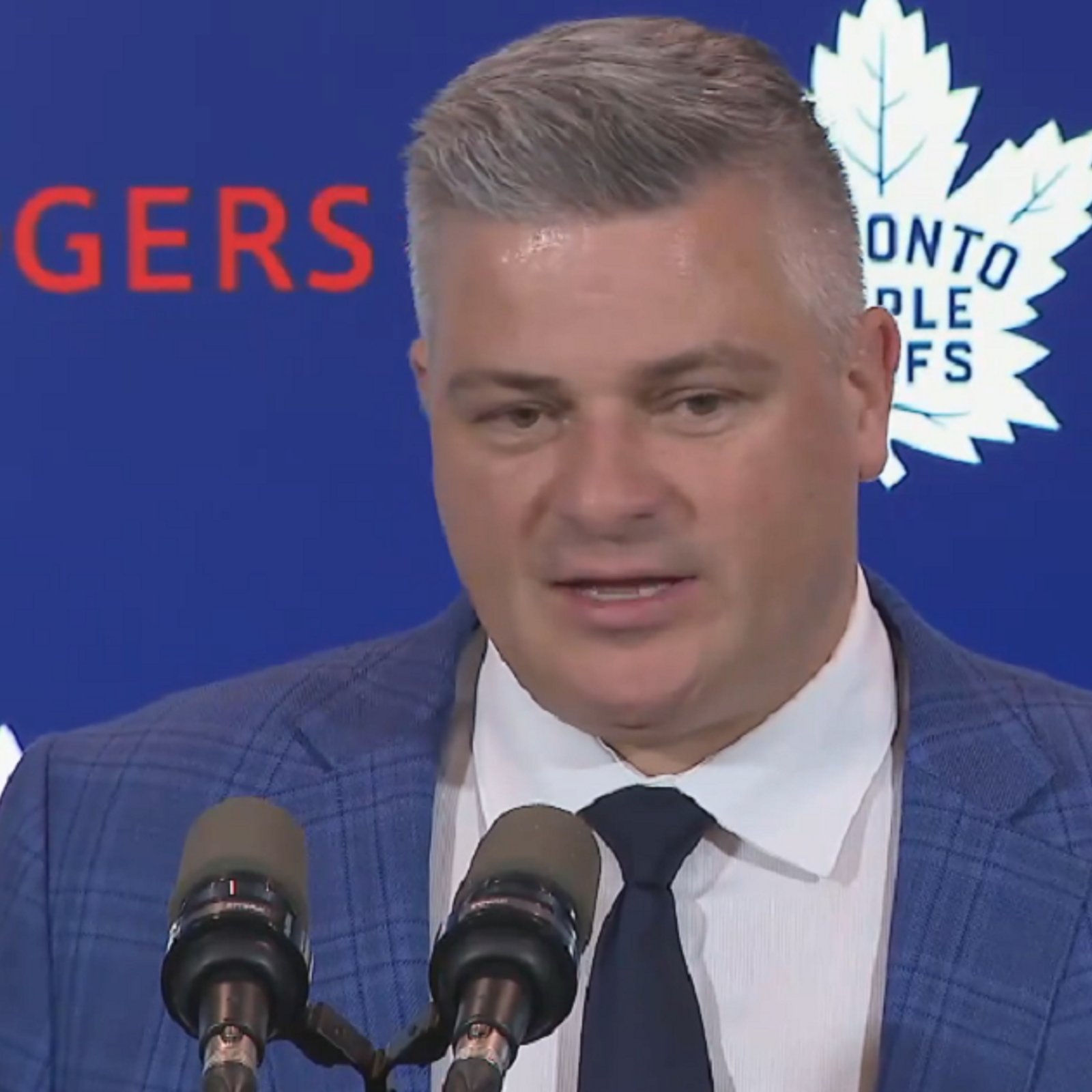
#3 The Toronto Maple Leafs.
The Maple Leafs will actually have one of the better looking sponsorships when they play at home this season, but unfortunately the same will not be said of their look on the road. The Maple Leafs' sponsor will be Scotiabank and that partnership will be represented by a single and rather clean looking "S" on the Maple Leafs helmet. That "S" will feature in two different colors though and that is where the trouble comes in. When the Leafs are at home that "S" will appear on the Leafs' blue helmet in white, which perfectly fits their traditional color scheme, but on the road that "S" will appear on the Leafs white helmet in red.
Some Leaf fans already complained about the red sticking out too much, and I suspect it will look much worse when combined with the rest of the Leafs players equipment.
- Jonathan Larivee

Terrible news from Evander Kane just before Game 1.
- NHL News
- 2 minutes read
- Jonathan Larivee
Refs intervene over questionable act from Leafs after Game 1.
- NHL News
- 2 minutes read
- Jonathan Larivee
Bieksa, Bissonnette call out 2 Maple Leafs after a brutal Game 1.
- NHL News
- 3 minutes read
- Jonathan Larivee
Sheldon Keefe calls out Max Domi over Game 1 performance.
- NHL News
- 2 minutes read
- Jonathan Larivee
Seth Jones' comments rub fans in Chicago the wrong way.
- NHL News
- 3 minutes read